In this post I talked about the multiple problems wrong with our entry way.
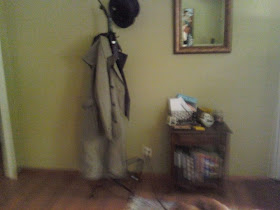
If you remember way back when, this is what it looked like after we painted the walls
Kinda bland and semi-functional and OH THE CORDS!! .. ugh..
The solution: to make the space more functional and proportionally fit the space
So I found a lot of tutorials on crate shelves on pinterest. I bought 4 crates from Jo Anns and got to working. I came up with a 4 crate box (not to big or small) with legs (to get it off the floor). The crates hold magazine holders with our magazines, two baskets for each of our mail and some books for decorations.
I also found this awsome mirror at home goods that was on clearance because it had a piece that was broken. If you look closely in the photo above you can see it if you look closely. I glued it and ta-da!
So after seeing this post on Bower Power blog I knew the turquoise door had to go and I wanted a black door. I used the same black paint as the post; onyx by glidden. The lamp on the divider is a hand me down, the gold frame is from a thrift store, the wooden seat is actually a queen's throne.
I also decided the inside needed some love to. I painted the door as well as the room divider. The hint of black on the top and a fresh coat of white is just what it needed
Added some new knobs and I just love it. I think that that black door brings out the other black accents
What do you think?
This post will be linking up to these blogs this week


No comments:
Post a Comment
Thanks for leaving me some love.